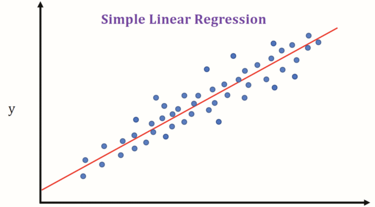
Today I will introduce how to use sklearn to draw linear regression chart in Python 3. As we know, the linear regression is one of the most important and widely used regression techniques. This is one of the easiest regression methods. One of its main advantages is that it is easy to interpret the results.
Let’s take look at the code:
					import numpy as np
from sklearn.linear_model import LinearRegression

def simple_linear_regression():
    """data is dataframe type. You can use yahoo history data as your data source"""
    y = data.loc[:, 'Close'].to_numpy()
    x = data.index.to_numpy().reshape((-1, 1))
    """Invoke LinearRegression() method to initialize regression model"""
    model = LinearRegression().fit(x, y)
    print('intercept:', model.intercept_)
    print('slope:', model.coef_)
    """We can use the predict method to generate forecast data"""
    y_pred = model.predict(x)
    return y_pred
The code is very easy to understand. One thing I need to mention here is that The fit method needs two dimensional array as x, the first parameter. Therefore, we use reshape((-1, 1)) to convert the data.index.to_numpy() to two dimensional array from one dimensional array.
TIP: data’s type is DataFrame, data.index type is PandasArray. data.index.to_numpy() converts PandasArray to Array.
The predict method will get the corresponding predicted response. So far, the chart you draw will look like this:

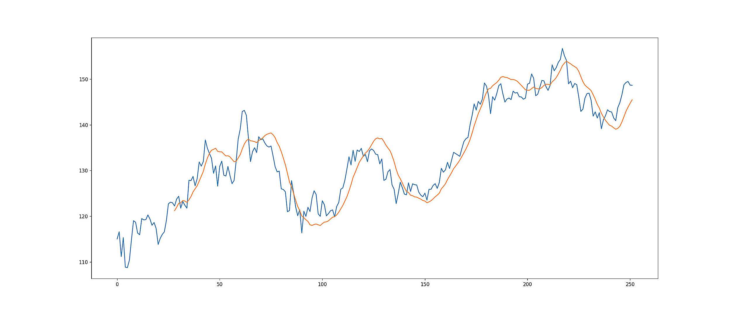
To draw the line like Linear Regression Forecast indicator in Yahoo Finance, we need to iterate the simple_linear_regression method. For example, we set up the window is 14 days for the Linear Regression Forecast indicator. Then we need to use the old 14 days data to generate predicted 14 data and the 14th data point is what we want to draw the Linear Regression Forecast indicator. It’s hard to describe it. Let look at the code:
					predict_list = pd.Series([], dtype=pd.Float64Dtype)
window = 14

for i in range(window, len(data.index)):
    predict = simple_linear_regression()
    predict_list = predict_list.append(pd.Series([predict[-1]]), ignore_index=True)

fig, axes = plt.subplots(1, 1, figsize=(21, 9), sharex=True, dpi=120)
plt.plot(predict_list.index, predict_list.values)
Hopefully it helps you to draw the indicator successfully.
Here, I would like to recommend readers to read this article: Linear Regression in Python. This article is super helpful on understanding what is linear regression!
If you want to learn Python, I have some books as well. such as this one: Data Structures And Program Design Using Python – A Self-Teaching Introduction 2021
Views: 104

Good post. I learn something new and challenging on websites I stumbleupon on a daily basis.
It will always be useful to read through articles from other authors and use something from other
sites.
It’s genuinely very difficult in this busy life to listen news on Television, thus
I just use world wide web for that purpose, and take the
latest news.